Returns a plot of decision rules from the results of
calc_decision_rules that can interactively show when to stop and
when to proceed at the various interim analyses
Usage
# S3 method for class 'calc_decision_rules'
plot(x, plotly = TRUE, ...)Value
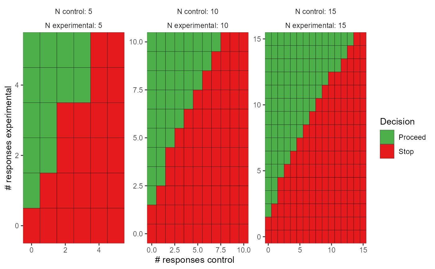
In the one-sample case, a heatmap plot with number enrolled on the x-axis and number of responses on the y-axis. In the two-sample case, a grid of heatmap plots. Each plot is a combination of the number enrolled so far in the experimental and control arms. The x-axis is the number of responses in the control arm and the y-axis is the number of responses in the experimental arm. Green indicates combinations where the trial would proceed and red indicates combinations where the trial would stop.